ProjectsMay 18, 2026

NordCode — High-Trust Technical Identity & Studio Platform

image
Core Promise: Engineering rigor is communicated through craft, speed, and precision in every pixel.
When building a digital surface for a software engineering studio like NordCode, the product is not an unbounded database or an internal admin tool—the product is trust, craft, and technical competence. Prospective clients evaluating software agencies assess execution speed and architectural discipline directly through the agency's own digital presence. A generic template signals generic engineering. A meticulously polished, high-performance interface signals rigor, attention to detail, and architectural maturity. This project delivers a bespoke design system, zero-runtime interaction architecture, and precision-engineered micro-animations for NordCode, transforming a studio website into a high-converting, engineering-grade brand experience.
99/100Lighthouse Performance & Core Web Vitals
< 1 KBZero-runtime viewport animation bundle
100%Design token coverage via dynamic HSL variables
60 FPSFluid GPU-accelerated scrolling & hover states
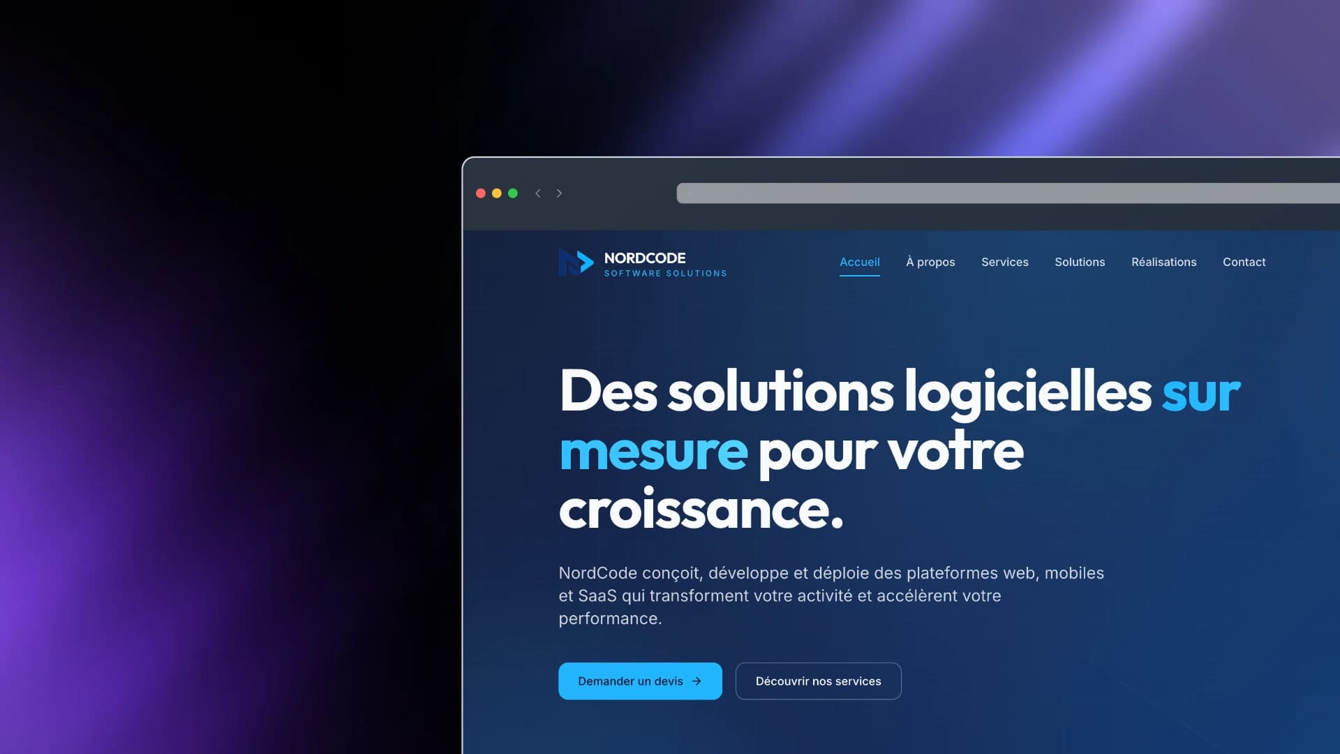
NordCode Technical Identity & Landing Page Overview
We engineered a palette rooted in deep navy tones complemented by high-frequency electric cyan accents, evoking enterprise reliability combined with modern digital sharpness.
  • Primary Canvas (hsl(222, 70%, 12%) to hsl(222, 70%, 17%)): Deep midnight navy evoking stability, enterprise trust, and depth.
  • Electric Cyan Accent (hsl(200, 100%, 55%)): High-contrast focal points, CTA glows, and interactive states.
  • Surface Elevation: Light secondary backgrounds (hsl(210, 30%, 96%)) paired with subtle glassmorphic backdrops (backdrop-blur-xl).
Css
/* Design tokens defined in index.css */
:root {
  --primary: 222 70% 17%;
  --accent: 200 100% 55%;
  --gradient-hero: linear-gradient(
    135deg,
    hsl(222 70% 12%) 0%,
    hsl(222 65% 20%) 50%,
    hsl(210 80% 32%) 100%
  );
  --shadow-glow: 0 0 60px -10px hsl(200 100% 55% / 0.45);
}
We paired two typefaces to cleanly separate editorial hierarchy from interface data reading:
  1. Outfit (Display / Headings): Geometric sans-serif with distinct character, wide aperture, and balanced geometric curves for impact.
  2. Inter (Body / Interface): Neutral neo-grotesque font optimized for high legibility across densities, with OpenType feature settings enabled (cv11, ss01).
Standard card layouts rely on heavy dropped shadows or thick container borders, which can clutter visual hierarchy. We developed a 1px background gap stripe grid inspired by engineering schematics.
  1. The grid container has a 1px gap over a tinted border background (bg-border/80).
  2. Each item renders as a solid background tile with hover background transitions.
  3. On mouse hover, four micro corner crosshairs fade in around the cell, evoking precision targeting.
Tsx
// src/components/StripeGrid.tsx
const StripeGrid = ({ cols = 3, items }: StripeGridProps) => {
  return (
    <div className="relative">
      <div
        className={`grid grid-cols-1 ${colsClass[cols]} bg-border/80`}
        style={{ gap: "1px" }}
      >
        {items.map((item, i) => (
          <Reveal key={item.key} delay={i * 60}>
            <div className="group relative bg-background h-full transition-colors duration-500 hover:bg-secondary/60">
              {/* Corner crosshairs at grid intersections */}
              <span className="pointer-events-none absolute -top-[5px] -left-[5px] w-[10px] h-[10px] border-l border-t border-accent opacity-0 group-hover:opacity-100 transition-opacity" />
              <span className="pointer-events-none absolute -top-[5px] -right-[5px] w-[10px] h-[10px] border-r border-t border-accent opacity-0 group-hover:opacity-100 transition-opacity" />
              <span className="pointer-events-none absolute -bottom-[5px] -left-[5px] w-[10px] h-[10px] border-l border-b border-accent opacity-0 group-hover:opacity-100 transition-opacity" />
              <span className="pointer-events-none absolute -bottom-[5px] -right-[5px] w-[10px] h-[10px] border-r border-b border-accent opacity-0 group-hover:opacity-100 transition-opacity" />
              {item.content}
            </div>
          </Reveal>
        ))}
      </div>
      <div className="pointer-events-none absolute inset-0 border border-border/80" />
    </div>
  );
};
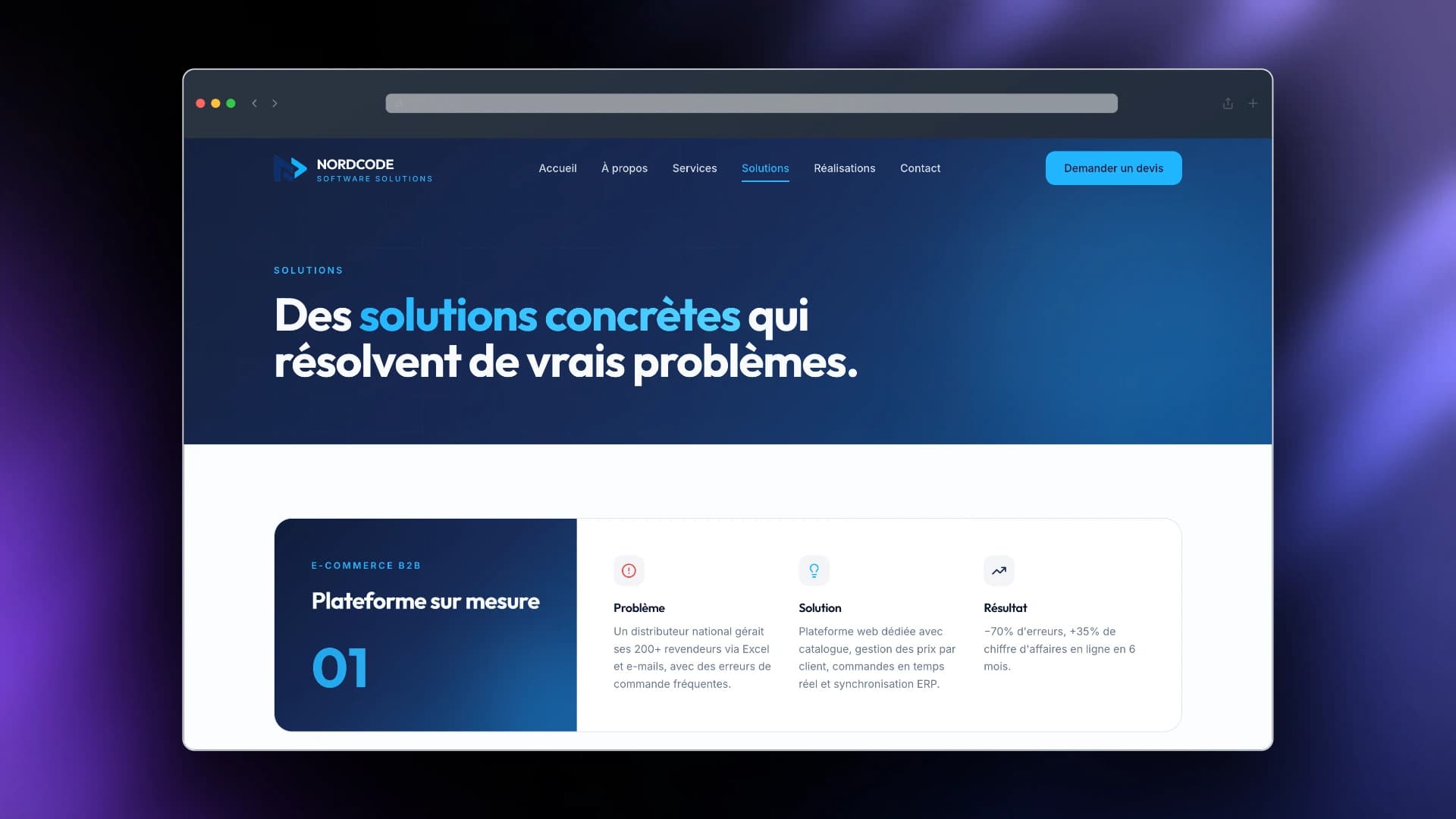
NordCode Solutions & Structured Service Architecture
Rather than pulling in heavy animation libraries (e.g., Framer Motion, GSAP) which inflate bundle size by 30–50KB+, we built a native IntersectionObserver reveal primitive.
  • Weight: < 30 lines of code, 0 external dependencies.
  • Hardware Acceleration: Triggers pure CSS GPU transitions (transform: translateY and opacity).
  • Memory Efficient: Automatically unobserves elements once revealed, cleaning up listener references.
Tsx
// src/components/Reveal.tsx
const Reveal = ({ children, delay = 0 }: { children: ReactNode; delay?: number }) => {
  const ref = useRef<HTMLDivElement>(null);
  const [visible, setVisible] = useState(false);

  useEffect(() => {
    const el = ref.current;
    if (!el) return;
    const obs = new IntersectionObserver(
      ([entry]) => {
        if (entry.isIntersecting) {
          setVisible(true);
          obs.unobserve(el);
        }
      },
      { threshold: 0.12 }
    );
    obs.observe(el);
    return () => obs.disconnect();
  }, []);

  return (
    <div
      ref={ref}
      style={{ transitionDelay: `${delay}ms` }}
      className={`transition-all duration-700 ease-out ${
        visible ? "opacity-100 translate-y-0" : "opacity-0 translate-y-8"
      }`}
    >
      {children}
    </div>
  );
};
The header dynamically shifts behavior based on scroll depth and page context:
  • Hero State: Transparent background with high-contrast inverted text when positioned over dark gradients.
  • Scrolled State: Glassmorphic frosted panel (backdrop-blur-xl bg-background/85) with subtle border separator and elevation shadow.
  • Mobile Menu: Fullscreen overlay with staggered route transitions and viewport scroll lock (document.body.style.overflow = "hidden").
To create depth without adding heavy images or slow canvas shaders, we layered lightweight CSS constructs:
  1. Subtle 48px Dot/Grid Matrix:
    Css
    .grid-pattern {
      background-image:
        linear-gradient(hsl(var(--accent) / 0.06) 1px, transparent 1px),
        linear-gradient(90deg, hsl(var(--accent) / 0.06) 1px, transparent 1px);
      background-size: 48px 48px;
    }
    
  2. Ambient Pulse Glows: Pure CSS blur spheres (blur-3xl) with gentle pulsating opacity keyframes (animate-glow-pulse) to create visual warmth behind key copy.
  3. Floating Watermark Geometry: The studio's brand logo rendered at 700px+ width with 7% opacity (opacity-[0.07]), subtly floating (animate-float) to ground the right edge of the viewport.
The page layout follows a clear persuasive narrative:
[ Hero: Clear UVP + Social Proof Stats (50+ Projects, 30+ Clients) ]
                             ↓
[ Core Capabilities: 6 Structured Service Verticals in StripeGrid ]
                             ↓
[ Differentiators: Engineering Standards & Rigor Checklist ]
                             ↓
[ Trust Anchor: Client Logo Strip ]
                             ↓
[ High-Contrast CTA Banner: Direct Inbound Lead Capture ]
  • Replaced ambiguous agency jargon with explicit service titles: "Développement Web & Mobile", "Solutions SaaS", "Intégration ERP / CRM".
  • Paired every service card with an animated hover affordance (En savoir plus ->) to invite deeper exploration.
  • Integrated quick quantitative credibility indicators directly within the hero fold.
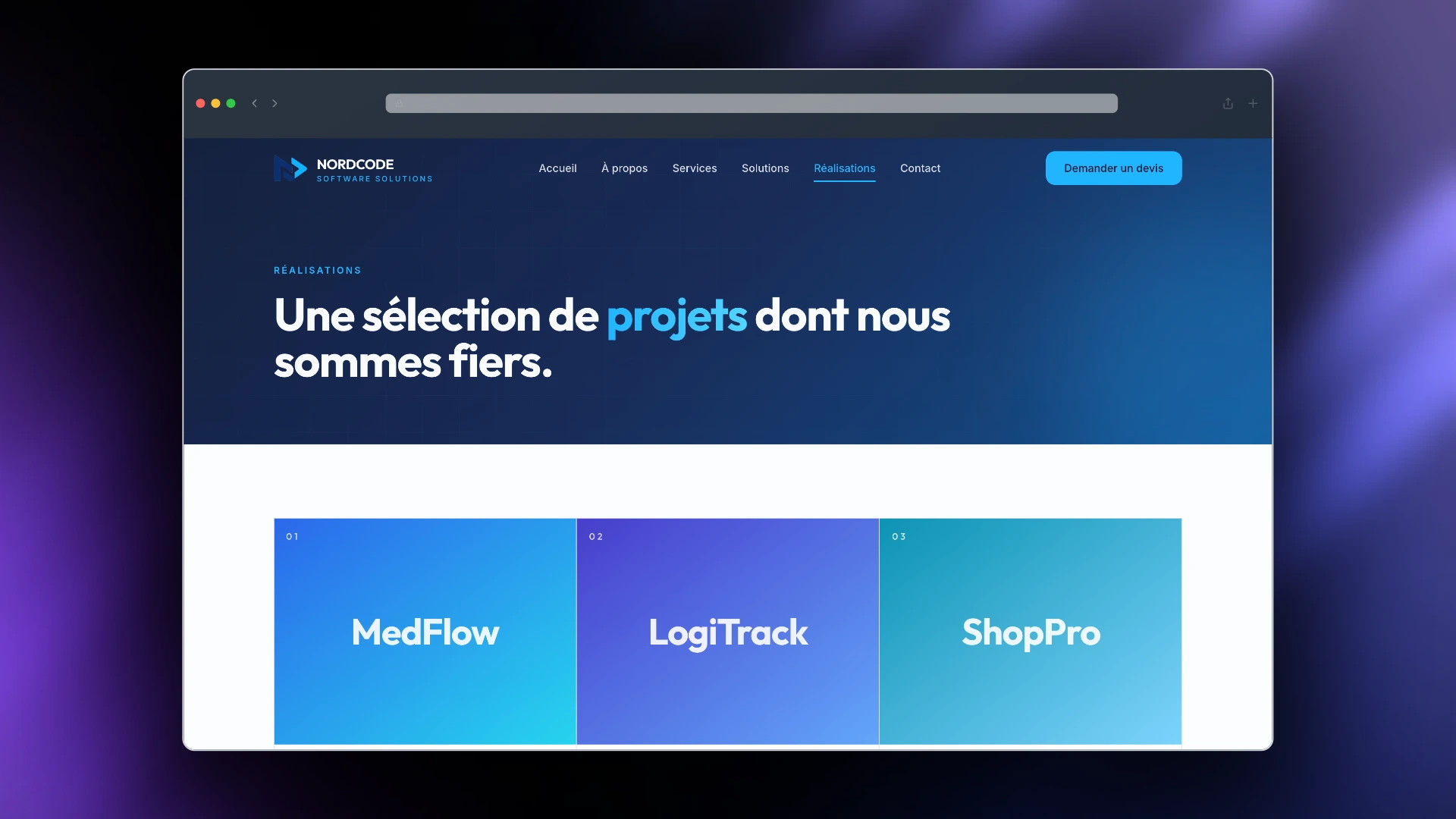
NordCode Realisations & Case Study Showcase
Metric / Feature
Implementation
Outcome
Styling StrategyTailwind CSS + CSS Variables (HSL)100% themeable, instant dark-mode readiness
Animation OverheadNative CSS + IntersectionObserverZero runtime overhead, 60fps scroll performance
AccessibilitySemantic HTML5, Radix primitives, aria attributesFull screen-reader and keyboard navigability
Responsive GridCSS Grid with 1px border gap trickPixel-perfect alignment across mobile, tablet, desktop
A studio landing page does not need bloated state libraries or heavyweight animation bundles to demonstrate elite technical capabilities. Clean component contracts, strict token systems, and obsessive micro-interaction polish speak directly to technical craftsmanship.

Related projects

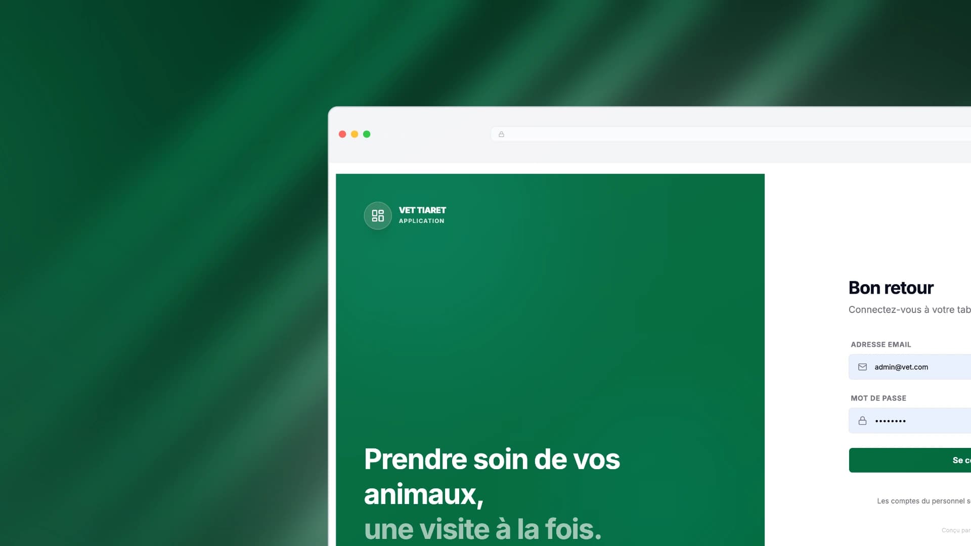
Vet Tiaret — Bilingual Clinical Intake, Triage & Scheduling Platform

Vet Tiaret — Bilingual Clinical Intake, Triage & Scheduling Platform

Engineering an end-to-end veterinary clinical intake, triage, and scheduling ecosystem with real-time symptom classification, reducing staff call load by 65% and cutting appointment no-shows by 40%.
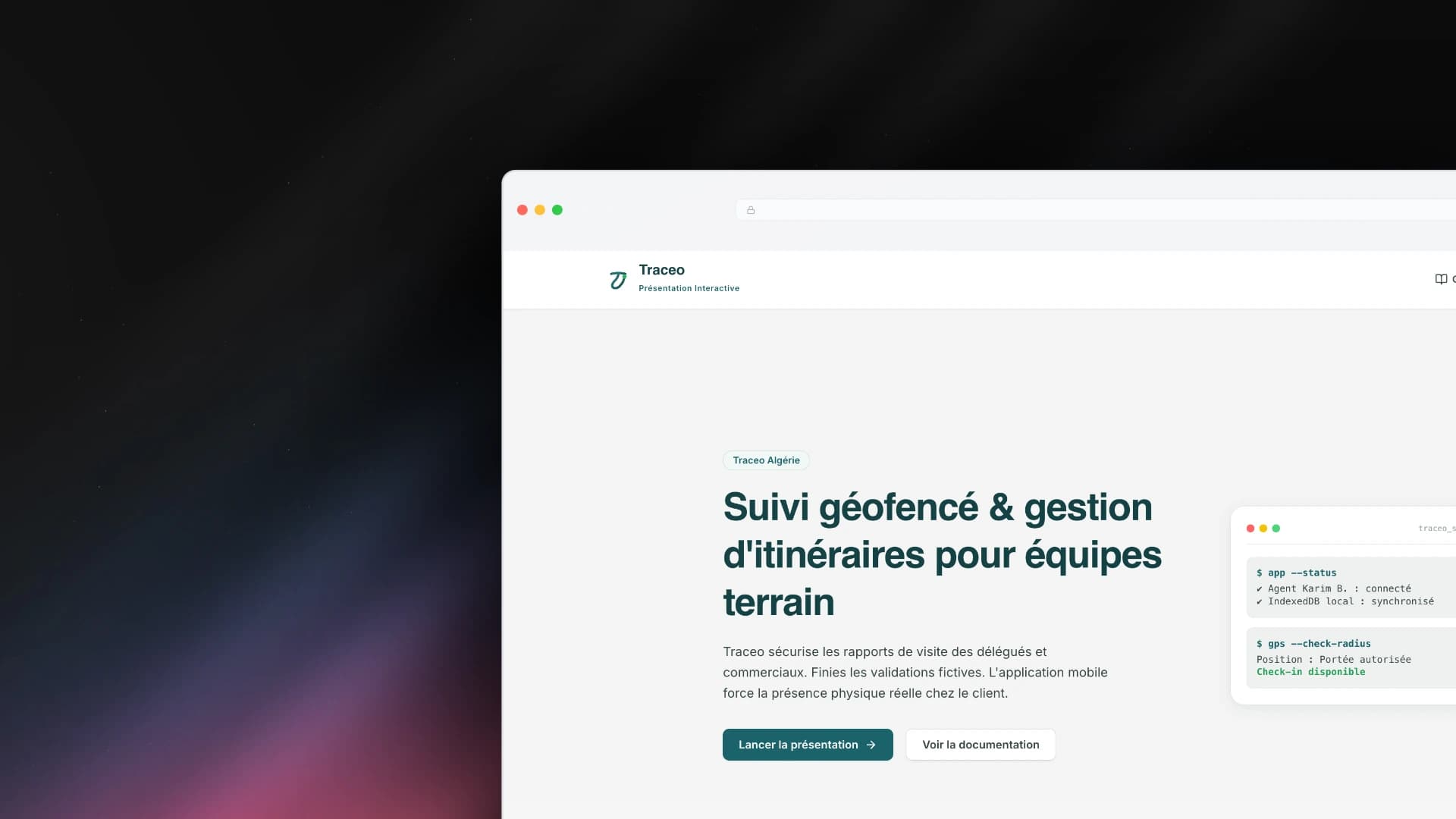
Traceo — Offline-First Geofenced Field Operations & Route Management Platform

Traceo — Offline-First Geofenced Field Operations & Route Management Platform

Engineering an offline-first enterprise SaaS platform that eliminates falsified field reports, guarantees physical visit authenticity via GPS geofencing, and automates recurring route distribution.
Luma — Calm Client Operations Assistant & Temporal Memory System

Luma — Calm Client Operations Assistant & Temporal Memory System

Designing and engineering a calm client operations system that turns natural conversations into evolving attention, eliminating mental load for solopreneurs.
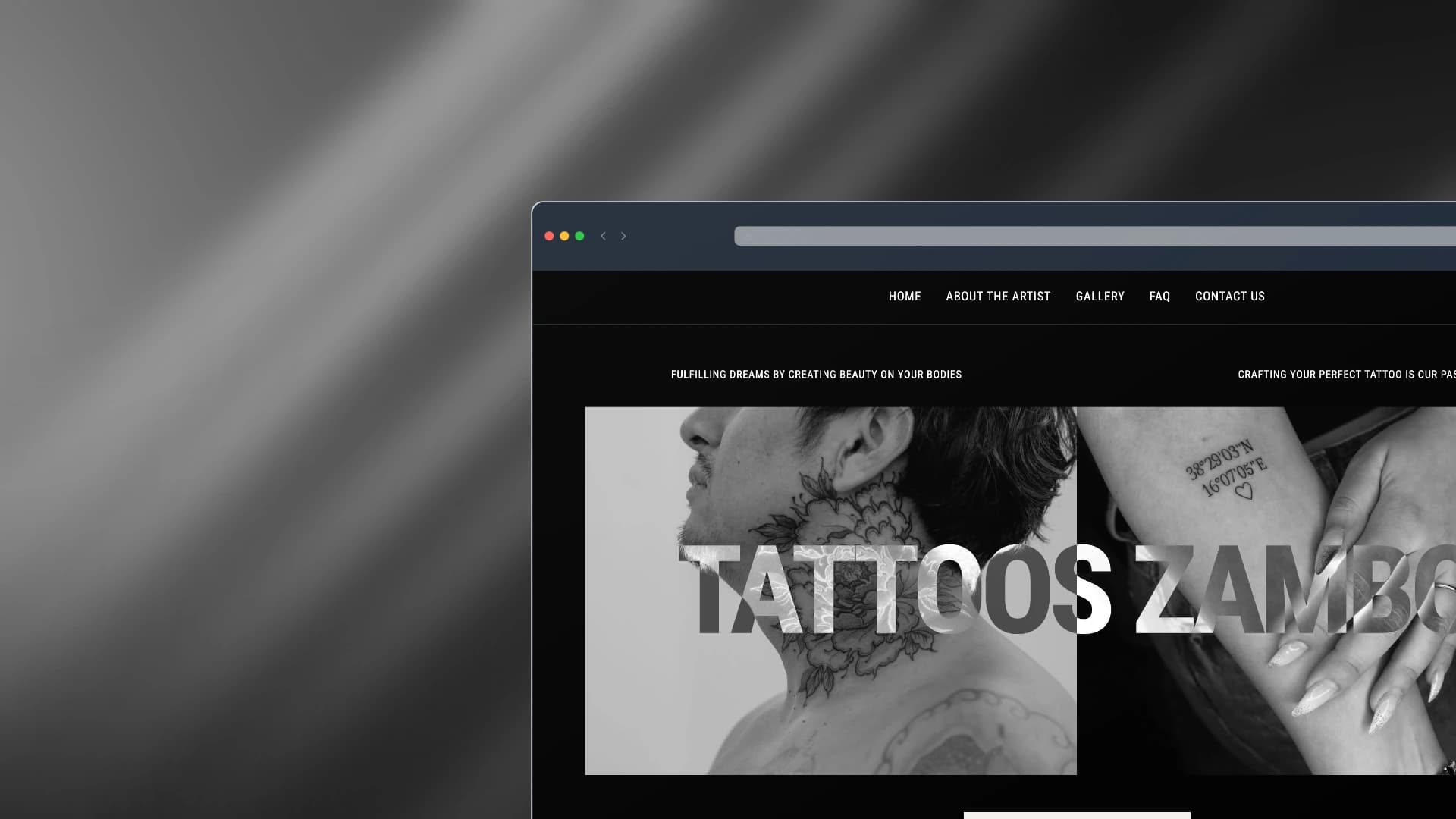
Zambo Tattoo — Studio Landing Page & Artist Showcase

Zambo Tattoo — Studio Landing Page & Artist Showcase

Designing and building a bold, high-contrast digital showcase and landing page for Zambo Tattoo studio with an interactive artwork gallery, artist spotlight, and seamless client booking flow.
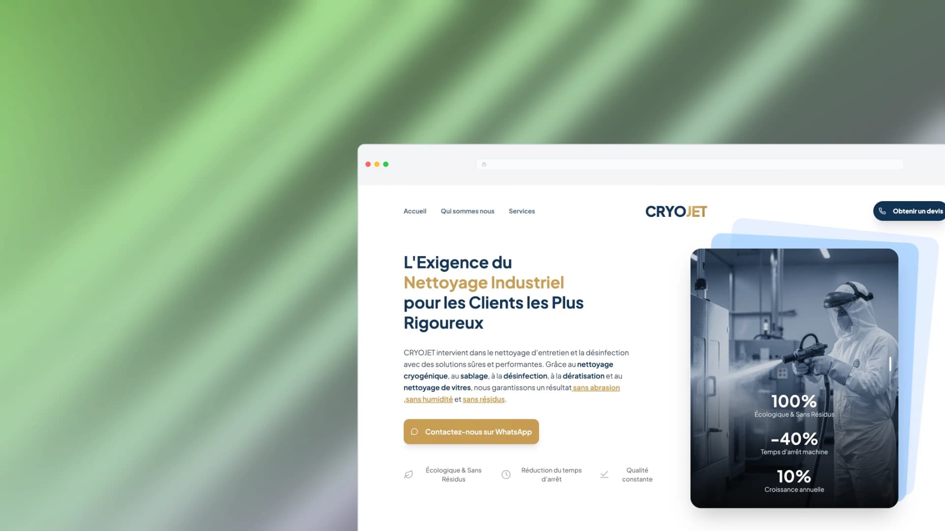
CRYOJET — B2B Industrial Growth Platform & Digital Transformation

CRYOJET — B2B Industrial Growth Platform & Digital Transformation

Designing and engineering an enterprise B2B platform for Algeria's leading cryogenic industrial cleaning contractor—demystifying dry-ice technology, eliminating sales cycle latency with instant WhatsApp routing, and capturing enterprise leads across 58 wilayas.